2
$\begingroup$

enter image description here

In Perloff's intermediate microeconomics book, he explains that producer surplus will increase with policies that limit entry. I get this intuitively - if we limit competition, producers will earn rents in the long run - but I am not following the graphical explanation. The text reads as follows:

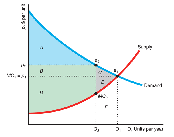
"Although government policies may cause either the supply curve or the demand curve to shift, we concentrate on policies that limit supply because they are used frequently and have clear-cut effects. If a government policy causes the supply curve to shift to the left, consumers make fewer purchases at a higher price and welfare falls. For example, if the supply curve in Figure 9.3 shifts to the left so that it hits the demand curve at e2, then output falls from Q1 to Q2, the price rises from p1 to p2, and the drop in welfare is −C − E. The only “trick” in this analysis is that we use the original supply curve to evaluate the effects on producer surplus and welfare."

Can someone explain to me the intuition behind this "trick"? There is nothing provided in the text. I don't understand why we wouldn't use the "new" supply curve to calculate welfare.

To add in for reference, in a previous version of the textbook Perloff uses the following graph as an example. This graph makes sense to me. The new one does not given what is written unless it assumes a vertical supply curve.
enter image description here

$\endgroup$

1 Answer 1

1
$\begingroup$

I think calling this 'trick' is a bit of a misnomer because there is nothing particularly tricky about it.

When you make any welfare analysis of some change (tax/quota etc.) you need to compare situation after change with situation before change. For that reason you calculate the deadweight loss (DWL) of policy as a difference between consumer surplus before policy and after policy.

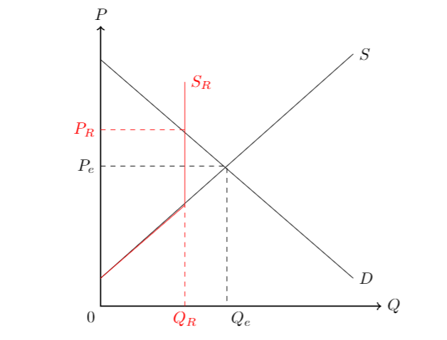
In your case the problem (including new restricted supply $S_R$ - painted in red color) would look like in the following picture I made (I linearized the problem in order to make the picture easier to render).

In order to calculate deadweight loss here you would first calculate the area of big triangle bounded by the original supply and demand (in black) and then subtract the area of the trapezoid that is created by the new restricted supply (in red).

I am surprised they call it a trick in that textbook since this is how DWL from a policy is defined. Following Mankiw Principles of Microeconomics 8th ed. pp 157:

Deadweight Loss: the fall in total surplus that results from a market distortion, such as a tax

To calculate what a fall in CS is you need to either implicitly or explicitly take into account what the original situation was. One way of how to calculate this explicitly is to see what the original supply and demand was and comparing it to the new situation.

enter image description here

$\endgroup$
11
  • $\begingroup$ Thanks! I agree it’s a poor word choice. What I meant by not understanding why we wouldn’t use the “new” supply curve is for calculating the after policy surplus to compare to the before policy surplus - and thus get our DWL. In a tax example it looks a little different because there is tax revenue, etc. But in the graph you drew, it makes sense. The problem with the Perloff text is that they do not specify how the supply shifts. I was imagining a parallel shift, which didn’t make sense to me. I appreciate your example. $\endgroup$
    – K Carroll
    Commented Dec 4, 2020 at 1:10
  • $\begingroup$ @KCarroll you would get parallel shift with tax. With supply restriction the supply just becomes completely inelastic (vertical) at the point of restriction - this should make intuitive sense to you because when supply is restricted that means that no matter what price is supply can be maximum just that restricted quantity. By the way, if you think this answered your question consider accepting it (and consider doing so also for some of your older questions where you got answers) $\endgroup$
    – 1muflon1
    Commented Dec 4, 2020 at 1:13
  • 1
    $\begingroup$ @KCarroll that depends on the nature of implicit restriction. It could be stepwise if the restriction depends on price but even purely implicit restriction if it is hard (that is for example firm cannot produce more than 20 units due to not being able to raise capital at capital markets for such quantity) then it will be vertical line again. The line tells you how supply depends on price. If supply cannot increase when price does it will become vertical. $\endgroup$
    – 1muflon1
    Commented Dec 4, 2020 at 1:27
  • 1
    $\begingroup$ The text says "if the supply curve in Figure 9.3 shifts to the left". There's nothing indicating that it becomes vertical at $Q_2$. I guess the "trick" consists of ignoring the fact that parts of $B$ and $D$ also disappear. $C+E$ is actually the minimal welfare loss resulting from any such shift of the supply curve to the left. $\endgroup$
    – VARulle
    Commented Dec 4, 2020 at 10:58
  • 2
    $\begingroup$ The picture, yes, but the text? I find it odd to describe a supply limitation as a "shift of the supply curve to the left". And also then there's no "trick" involved, as you noted. Anyhow, the explanation in the textbook is just not very good... $\endgroup$
    – VARulle
    Commented Dec 4, 2020 at 12:02

Your Answer

By clicking “Post Your Answer”, you agree to our terms of service and acknowledge you have read our privacy policy.

Not the answer you're looking for? Browse other questions tagged or ask your own question.