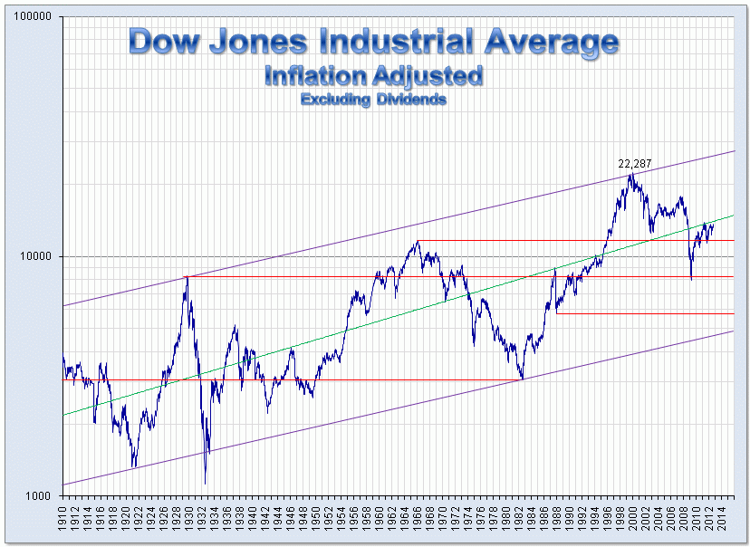
I have seen charts like this one  showing the return for the past 100+ years cited as evidence why one should invest in stocks for their retirement. I don't disagree with that, but realistically, nobody invests for 110 years; my guess is that they actually invest for 20-30 years on average (for those who actually have a retirement account).
Also, it's not advised to try to play the market by investing in individual stocks, but rather mutual or index funds, so nobody can actually invest in "the stock market", but rather some subset of stocks.
So if I were making a case for someone to invest their retirement money in the stock market on a long-term basis, I would want to show them historical returns for popular consumer-grade funds over 20-30 year periods. The Dow over 110 years doesn't really tell me what an average investor's returns might look like (I understand that past performance is not indicative of future performance, but this is the whole reasoning behind looking at a chart of historical returns).
Has anyone crunched the numbers on this and published the charts and figures?
Edit: The wikipedia article notes that "[t]he first retail index fund, First Index Investment Trust, was formed in 1976...", so it looks like mutual fund investing by the average Joe could only have been done since then. Which makes the 100-year charts even more irrelevant.