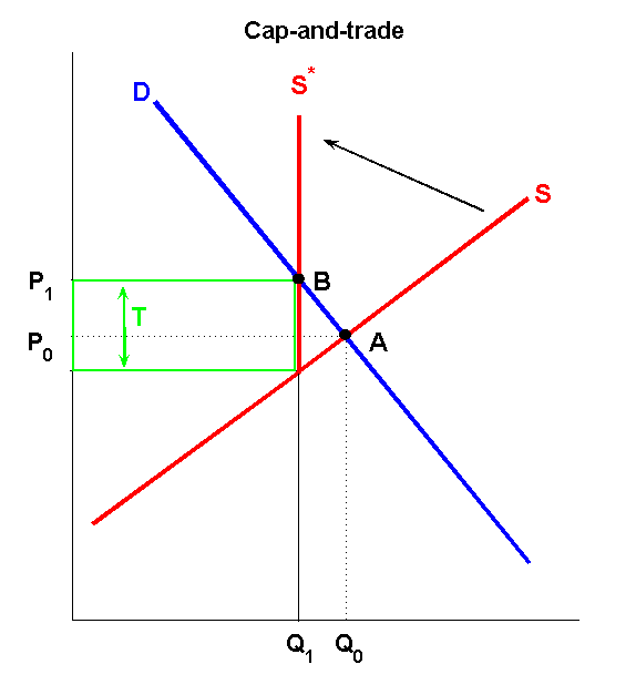
Is there a way to show the incidence of cap and trade in a diagram? Similar to how in an indirect tax graph you can show consumer and producer incidence. I assume that the consumer incidence of cap and trade will be greater if the demand curve is inelastic.
This is like my cap and trade diagram. It's the market for the product not the market for permits.

