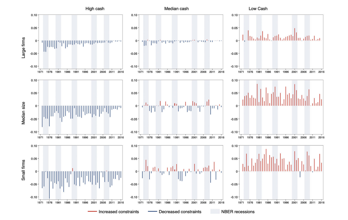
Could you advise on whether Stata is suitable for generating this figure?
You could definitely generate figure like this in Stata. All the functions you need to plot this exist in Stata. However, Stata is quite clunky when you want to use other than their default template.
If not, which software (Stata/R/Python/MATLAB) would you recommend?
This graph could be created in any of the above mentioned programs and languages.
However, programming languages like R and Python will give you much more control over the aesthetics of the graph. I personally like to create these kind of graphs in R with packages like ggplot2, Python has also good packages.
Hence even though you can use any of them I would personally recommend R or Python. They also both have advantage that they are freeware so you can still work with them even if your organization does not pay for the expensive license.
Furthermore, I would appreciate guidance on the appropriate software and commands to achieve this visualization. I have attached an image illustrating the desired figure.
Without minimal working example it is impossible to give you code that would give you that kind of picture. At best I can give you packages or functions that perform the calculation.
For example, in Stata you can calculate median of any variable (eg your change in financial constraint), while controlling for some category (in your case those asset terciles) as:
bysort category: egen group_median=median(var)
To make bar chart like this you will want something like:
webuse turksales, clear
twoway bar var t
Of course based on your specific data you might have to do number of other intermediate steps. As mentioned its virtually impossible to just give you code for some arbitrary data.
