5
$\begingroup$

The question I really want to make is if poverty is decreasing of increasing worldwide, but since I guess there is no way to objectively define poverty, that question doesn't fit in here. I was always suspicious that when they release the poverty statistics, they always release the extreme poverty figures and not the poverty figures. For example, recently I found people living under 10 dollars a day either was increasing or it's stagnant (green line, as if they weren't poors). So this leads me to believe poverty is conveniently defined as for showing "poverty is decreasing worldwide". That's why I would like to know if there is a way to figure out how many people leaves under 15 dollars (or any other figure between 10 to 15 dollars, if you like) which according to my country statistics for poverty it would be poverty. By seeing the green and blue lines in this graph the best guess is it's increasing, but I don't have data to sustain that assumption.

So the question is, how many people in the world were living below 15 dollars a day in the last decades?
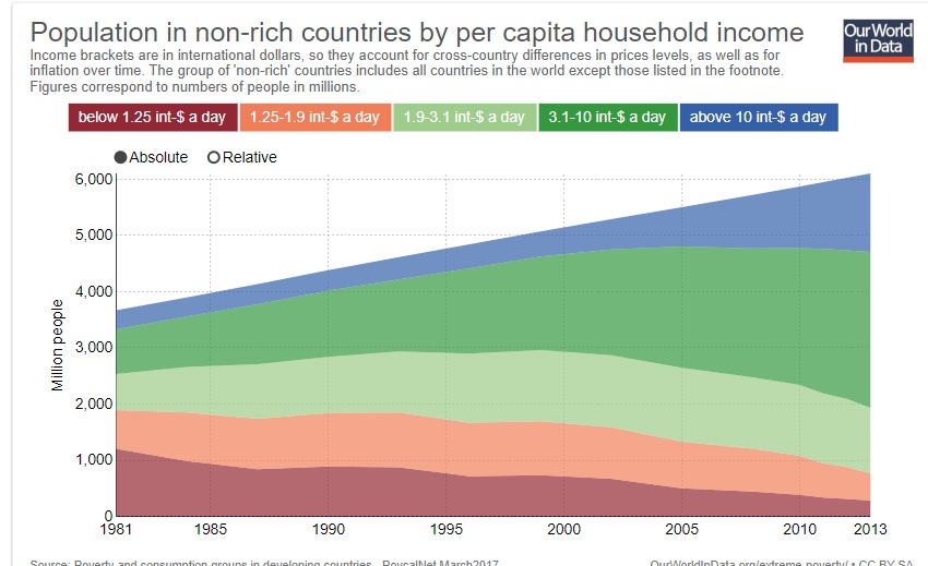
enter image description here

$\endgroup$
1
  • $\begingroup$ Globally $\$15$/day or about $\$5500$ a year is well above median income. Indeed, as your chart shows, so is $\$10$/day. Your chart shows the proportion of the world's growing population above $\$10$/day growing substantially since 2000, meaning that the proportion below $\$10$/day falling substantially. Much of this will have been in China - see the related chart in economics.stackexchange.com/a/13308/8891 $\endgroup$
    – Henry
    Commented Aug 31, 2017 at 21:08

2 Answers 2

4
$\begingroup$

Most of the "official" statistics compiled in international organisations use some thresholds like the one shown in the graph. Common for instance are the one by the World Bank (data here and report here).

Therefore, unless you find such data already computed, it is not possible to tell.

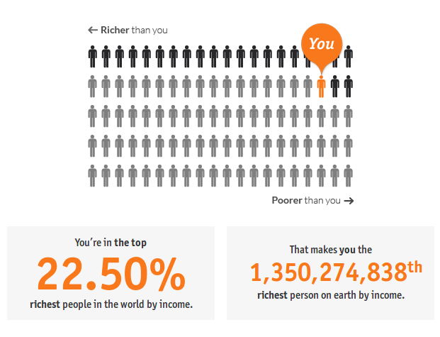
There is one imprecise alternative though. You can use this online tool to compute global poverty based on any threshold you like (using annual income in £). For example, 15 US dollars correspond to roughly to £11.64 (as of 31/08/17, 13:25 BST), which amounts to a yearly (365 days) income of £4,250, which yields:

enter image description here

As the FAQ explains, this analysis is based on data from the World Bank, is valid for 2008, and assumes a population of 6.69 billion. Therefore, based on the above result, 5.34 billion people lived below $15 a day in 2008. This is "sort of" consistent with the data in the graph you posted, in my opinion.

Unfortunately, such analysis is only valid for 2008.

$\endgroup$
1
  • $\begingroup$ thanks, I found another tool but having this one is also good $\endgroup$
    – Pablo
    Commented Sep 6, 2017 at 12:19
2
$\begingroup$

I found a tool in the World Bank website which allows you to set any income boundary, any country, years from 1980 to 2015 and display the data in charts to see how many people are under that boundary. You can set it to 15 dollars or any other figure.

$\endgroup$
1
  • $\begingroup$ Great tool! I was not aware of it. Thanks for sharing. $\endgroup$
    – luchonacho
    Commented Sep 6, 2017 at 12:31

Your Answer

By clicking “Post Your Answer”, you agree to our terms of service and acknowledge you have read our privacy policy.

Not the answer you're looking for? Browse other questions tagged or ask your own question.