You are correct.
Let's zoom out
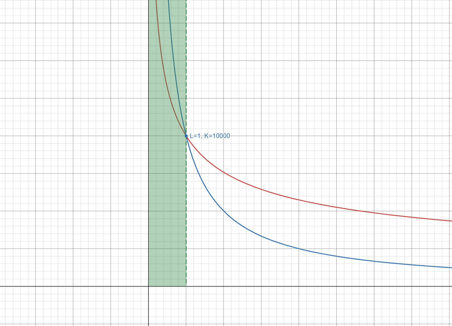
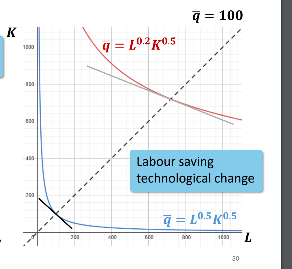
When transitioning from the blue curve $q = L^{0.5}K^{0.5}$ to the red curve $q = L^{0.2}K^{0.5}$, the production function reflects labour saving technological change, where labour's contribution to output diminishes relative to capital. However, the effect depends on the level of capital $K$. Let's consider this region by region.
Note the chart below is not to scale.

Low levels of capital $K < 10000$
At lower levels of $K$, capital is insufficient to compensate for the reduced role of labour in the red curve, where labour's productivity is weaker due to the smaller exponent $0.2$. Consequently, at fixed, low $K$, more labour is required on the red curve to achieve the same output as the blue curve:
$$
q = 100 \quad \implies\quad L_{\text{red}} > L_{\text{blue}}.
$$
At $K = 10000$
The two curves intersect because the contribution of labour and capital balance out equally in both production functions. At this point, both curves require the same amount of labour to achieve the same output:
$$
L_{\text{red}} = L_{\text{blue}} = 1.
$$
High levels of capital $K > 10000$
At higher levels of $K$, capital becomes abundant and can substitute more effectively for labour. This highlights the labour saving nature of the red curve, where less labour is required to achieve the same output compared to the blue curve:
$$
q = 100 \quad \implies\quad L_{\text{red}} < L_{\text{blue}}.
$$
Takeaway
Labour saving technological change doesn't always reduce labor requirements at every capital level:
- For $K < 10000$, labour requirements may increase because labour's contribution to output is weaker in the red curve.
- For $K > 10000$, the benefits of labour saving technology become evident as capital substitutes for labour, reducing labour requirements.

