3
$\begingroup$

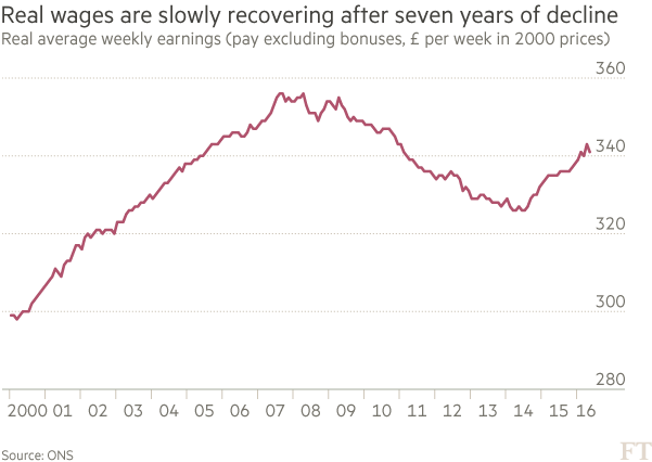
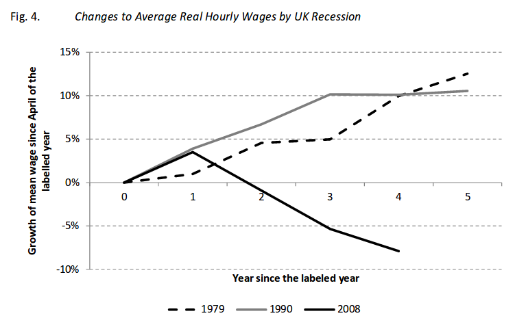
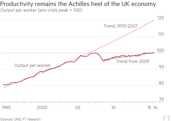
In reading this article from FT, we come across two graphs:

enter image description here

and

enter image description here

Shouldn't real wages have a similar trend to productivity? Why was there that discrepancy since the 2009 until 2014? Maybe some other factor that shifted the PS, or the WS curve? It's interesting to notice that in Jun 1st 2014 began the sharp fall in oil prices, which may be the cause for the increase in the real wage we've been observing until know. It seems that workers productivity has had little impact in the behaviour of real wages...

Any help would be appreciated.

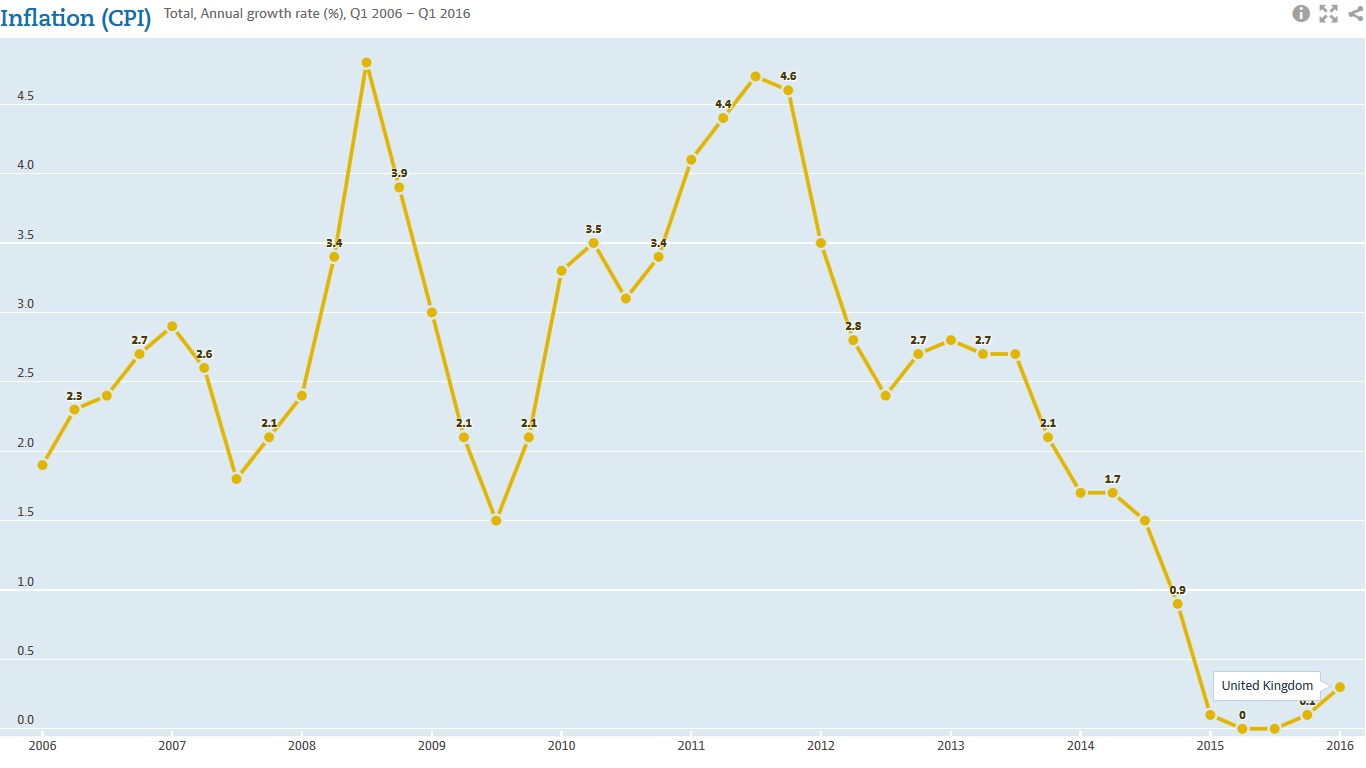
Edit: I'm including a graph with CPI in GBR with data from OECD.
enter image description here

enter image description here

enter image description here

$\endgroup$
8
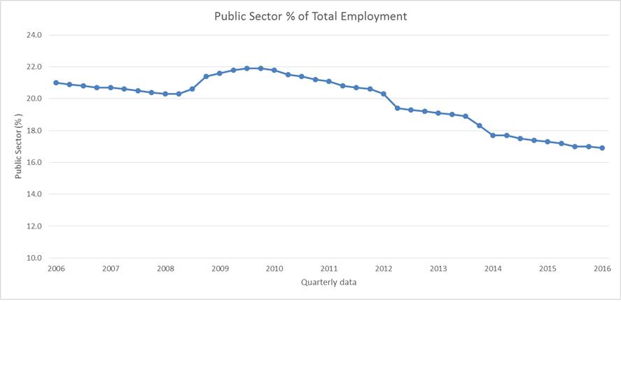
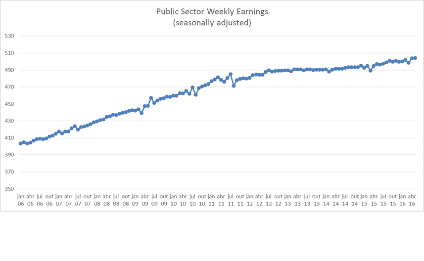
  • $\begingroup$ There are some scaling issues between your two graphs. The productivity fall in 2008-09 was due to the surprisingly small reduction in employment during the financial crisis and recession (in other recessions employment had fallen much faster and in some of them productivity had risen), but that crisis both doemestically and across Europe may have weakened UK wages for a longer period. There was also a public sector nominal wage freeze for several years leading to real reductions $\endgroup$
    – Henry
    Commented Aug 4, 2016 at 16:21
  • $\begingroup$ @Henry Thanks for your comment. What scaling issues are you referring to? $\endgroup$ Commented Aug 4, 2016 at 17:15
  • $\begingroup$ @Henry Does the public sector have that much weight to completely overshadow the private sector wage growth? Where would one be able to get that info? $\endgroup$ Commented Aug 4, 2016 at 17:31
  • $\begingroup$ On scaling, your first chart goes from 1995 to 2016 but your second from 2000 to 2016. Vertically 120 is about 70% higher than 70 while 360 is less than 30% higher than 280. So the slopes are not visually comparable. $\endgroup$
    – Henry
    Commented Aug 4, 2016 at 17:37
  • $\begingroup$ You can get a lot of UK wages data by sector at ons.gov.uk/employmentandlabourmarket/peopleinwork/… and more general labour market data at places like ons.gov.uk/employmentandlabourmarket/peopleinwork $\endgroup$
    – Henry
    Commented Aug 4, 2016 at 17:38

1 Answer 1

2
$\begingroup$

Blundell, et. al (2014) offer an explanation. According to them, the UK economy experienced a positive labour supply shock over that period.

First, they present the facts in a very intuitive fashion (graph taken from the working paper version):

enter image description here

They argue that the supply shock was due to two factors:

  1. changes in welfare policies that made work more attractive and tightened job-search conditions attached to the receipt of unemployment insurance benefits

  2. an increase in statutory pension age for women that strengthened their labor force attachment

I don't want to infringe copyrights so I won't include more figures, but look at Figure 14 (showing an increase in employment of older workers after the Great Recession), and Figure 15 and 16 (showing an increase in employment participation of Lone Mothers). As the authors state:

"The age limit for youngest child was set at twelve in November 2008 for all new claimants of Income Support and was lowered to ten in October 2009, seven in October 2010 and five in October 2011." (p. 392)

That is an example of a policy fostering employment participation and a positive supply shock.

$\endgroup$

Your Answer

By clicking “Post Your Answer”, you agree to our terms of service and acknowledge you have read our privacy policy.

Not the answer you're looking for? Browse other questions tagged or ask your own question.